The first impression makes a lot of difference in the online market. Sales, growth, profitability, and every other thing depend on what customers see and get attracted to. To attract customers, images play the most significant role. Images are that vital part of the online business which helps in gaining the attention of the customers. Therefore, it is important for the images to be eye-catching. Images help the customers in the evaluation of the product, compare it with different options and then make a purchasing decision. Use of good images increases the credibility of the seller as well as demonstrates the product in a suitable manner.
While shooting product images, most of the time, the background is a factor which is overlooked and not given much importance. But as a matter of fact, the background can make or break the final outcome of the overall image. The background can make both positive and negative impact on customers. While searching for products, neither of the customers is interested in bright and pop color background which steals the attention instead of the actual product.
For any image, it is important for the product to be the focal point. In order to get a fit background, one must keep in mind the following points
Avoid using a busy background
A background is the largest element of an image and use of a busy background will divert the attention from product to the background which is not helpful for the sellers. A busy background with a lot of elements in it is most of the time not suitable for a product image. One must also abstain from using a background with busy details as everyone is interested in seeing more of what they are searching for.
Use subtle colors
Bright colors look very unpleasing when you are searching for a product. Therefore, it is advised to use subtle colors for the background of product images because bright backgrounds are recommended for advertisements & banners not for a product image as I think you already visited the Apple’s website once in your life, right?
The background color has it’s great importance as it helps in making the product more visible out of the entire image. Some background colors go perfectly matched with the product, whereas some create blunders.
The light colored background is preferred for most of the product images but there are certain guidelines for images in different cases. In each case, a different color should be used as background. Also, a lot of online marketplaces have their own set of guidelines for a product image and the background color must be selected accordingly. However, for marketplaces, who do not have any guidelines, here is a guide for selecting an appropriate background color.
White background
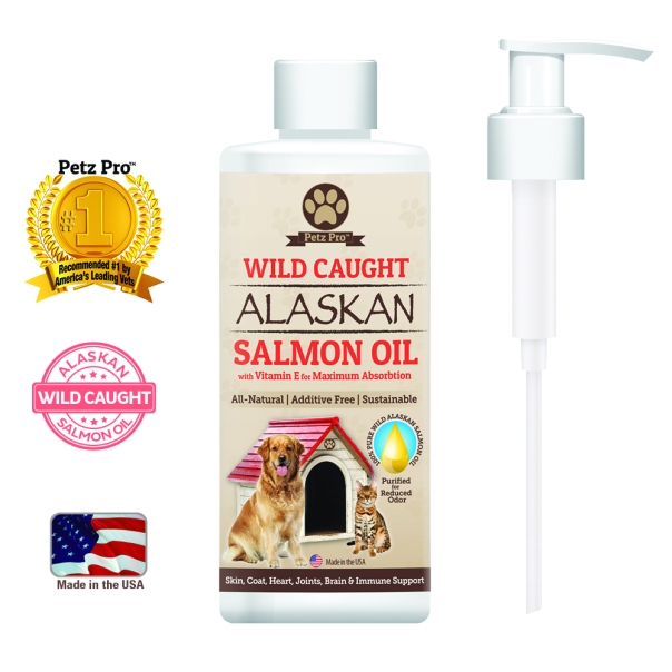
The White background is preferred for almost all product images. It has a lot of reasons behind it. White is the most subtle and neutral color which has the very low impact on the image. Therefore, it is chosen as the background Other than that, the white background is timeless and never goes out of the trend or look dull. Even though being lightest amongst all shades, white has its own charm which brings the best out of the image. Also, a white background makes the image look more product-centric and the product gets highlighted instead of the unwanted background. Specifically for glass products, a white background is used.
Grey background
Grey, specifically its lighter shade is also equally fitting for product image background as it is not too loud and does not steal the attention from the actual product. It’s another color in the neutral family. Product images look most appealing when they have a light background color such as white and grey. Grey color of the background is also used as a substitute of white color. Where the online marketplace uses white color as the page background, grey is used as the background color for product images to distinguish the page area from an image. Product images go well with the grey background, fulfilling the purpose of highlighting the product and not appearing bright at the same time. Grey color is most preferred in the fashion stores & for 3D mannequin product images.
Black background
The black color is although the darkest shade and may attract a lot of attention towards it at the first sight, but for some products, black color is the best choice. In case of jewelry, black background makes a lot of difference by making the diamonds and other metals shine brighter, resulting in a presentable and attractive product image.
Texture background
For those who may not want a plain background, yet want to remain on the basic side can choose simple and elegant textures such as marble texture, grid & gradient shades or any other texture to add a creative element to the product image.
Wooden floor
For furniture items such as table, chairs, the background does not play an important role, but floor matters a lot. In such cases, the wooden floor is recommended to amplify the product image because it gives an idea of how the product will look in the real world.
Removing the background and inserting suitable one with apt color is a challenging task. Either you can DIY or let ClippingPathUnited do this for you.


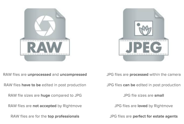 This is the subject of discussion since the beginning of digital photography. Am I shooting in Raw? What is raw Raw actually does not stand for anything, as its name suggests, it refers to the raw data emerging from the camera. The important difference is that raw files are uncompressed and untouched, while JPEG file formats are compressed and edited within the camera itself. Raw files capture data using the whole camera sensor and then the image output because it is also moving forward to larger file sizes. JPEG files usually output at lower quality because the camera processes the information, adds color and then compresses it to everyone in the final image